Positioning & verbal direction
Clarify audience, category, difference, proof and tone so visual choices have a reason.

We help Jaipur businesses separate useful brand equity from decoration, then build a system that works across products, packaging, catalogues and digital channels.
Explore the identity scope
01 / What we build
Clarify audience, category, difference, proof and tone so visual choices have a reason.
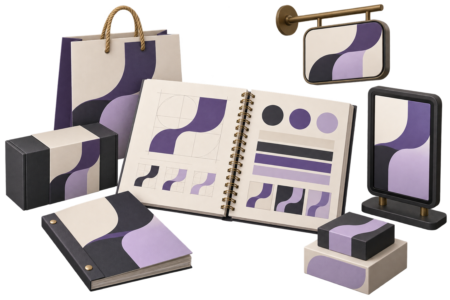
Design the agreed logo system, colour, typography, layout, imagery and supporting graphic language.
Test priority touchpoints and document how internal teams and production partners should use the identity.
City context, honestly stated
Jaipur’s craft, jewellery, textile and hospitality context informs the examples here; GreyBath works remotely and does not claim a Jaipur office.
Use genuine origin, material and process details while avoiding decorative claims the business cannot support.
Connect packaging, catalogues, signage, social content and ecommerce through one usable system.
Define channel-specific language and review craft terms, names and translations with knowledgeable people.
02 / Where it fits
The strongest identity reflects how a business makes, presents and sells, not just how a logo looks.
Present technique, material, makers and collections with accurate hierarchy and repeatable storytelling.
Build clarity across collections, certificates, packaging, retail and high-detail digital content.
Connect place, service tone, wayfinding, menus, booking and guest communication.
Modernise presentation while deciding which recognisable equity and history should remain.
03 / How we work
Review the business, audience, history and market; separate real proof from assumptions and decoration.
Develop the visual direction, then test it on priority applications rather than approving a logo alone.
Finalise files, usage rules, templates and production notes, then hand over with clear ownership.
Brand research, naming, applications, languages, packaging and rollout governance determine the work. Printing, photography, legal searches and production are separate unless stated.
Discuss your projectStakeholders, customers, competitors, existing equity, evidence and positioning questions to resolve.
The physical and digital touchpoints that need design, testing and production specifications.
Templates, files, training, partners, approvals and responsibility for future brand decisions.
Yes. We first identify useful existing equity (name, symbols, colour, typography or packaging cues) before deciding what to retain, refine or replace.
Packaging direction and priority formats can be scoped. Dielines, regulatory copy, material engineering, print proofs and production responsibilities are identified separately.
Yes. We test type, hierarchy, tone and approved wording in both scripts where required, rather than treating translation as a final production step.
Naming and verbal identity can be included with a defined exploration and screening process. Final legal and trademark clearance remains specialist work.
The proposal lists final logo files, colour and type specifications, templates, application designs and the level of guideline detail included.
A good business without a coherent identity?